Mobile First Design For Senior Care Sites
We design mobile-first senior care websites that create accessible healthcare experiences for older adults.
Our research shows that simplified navigation, larger touch targets, and high-contrast text greatly improve usability for seniors across all tech comfort levels.
By focusing on essential features for smaller screens and ensuring quick-loading content, we help connect families to vital services through devices seniors already use.
A thoughtful mobile approach doesn't just improve access—it builds trust and enhances care coordination for everyone involved.
Key Takeaways
The Growing Importance of Mobile Access in Senior Care
Technology is changing how you access healthcare in your golden years. More and more of you are using your mobiles to check symptoms, look up doctors, and book appointments.
Mobiles cost less than computers, making healthcare more available if you're on a tight budget. With websites designed for mobile use, we can provide steady care support whenever you need it—a must for our ageing community. Senior care websites with mobile-first design ensure simpler navigation and faster loading times, which is particularly beneficial for older adults who may be less tech-savvy.
Why Mobile-First Design Benefits Older Adults
Why Mobile-First Design Benefits Older Adults
Mobile-first approaches offer real advantages when designing for older adults. We focus on simple interfaces that reduce mental effort and make navigation easier for you. Larger touch targets help with declining dexterity, while high-contrast text improves readability if your vision isn't what it used to be. These considerate design choices build your confidence, making it more comfortable for you to use digital tools in your daily life. Since mobile devices are often cheaper and more accessible than computers, they provide an ideal platform for seniors to stay connected and access essential services.
Essential Features for Senior-Friendly Mobile Interfaces
When designing mobile interfaces for seniors, we focus on larger touch targets that help with decreased motor control and make your phone easier to use. You'll find our simplified navigation patterns reduce mental effort, with clear paths and consistent button placement. High-contrast colour schemes aren't just for looks—they're necessary for you if you struggle to see similar shades on small screens. Providing ease of use features is essential when developing senior-friendly mobile interfaces, as accessibility directly impacts adoption rates among older adults.
Larger Touch Targets
Larger Touch Targets
Let's talk about bigger touch targets – they're essential for older adults using mobile devices. Our research shows seniors with reduced dexterity simply need larger tap areas to use phones successfully. The need for expanded interface elements becomes increasingly important as manual dexterity declines throughout the aging process.
| Feature | Benefit for Seniors |
|---|---|
| 44x44px minimum size | Reduces frustration from missed taps |
| 16px additional padding | Creates forgiving click zones |
| Adequate button spacing | Prevents accidental selections |
| Consistent target placement | Builds confident interaction patterns |
These changes directly address the physical challenges many older users face daily. When we design with these specifications, your users can navigate with greater ease and confidence.
Simplified Navigation Patterns
Simple navigation for older users
We make mobile interfaces feel welcoming rather than daunting for seniors through straightforward direction-finding. Our approach includes simplified menu structures, avoiding nested options, and using clear labels with recognisable icons. We keep gestures basic and maintain consistent layouts across all screens. These choices reduce mental effort, limit confusion, and help you move through apps with greater confidence.
High-Contrast Color Schemes
High-Contrast Color Schemes
Creating high-contrast colour schemes is essential for senior-friendly mobile interfaces. We've noticed older users struggle with blue tones but respond better to warmer colours like reds and oranges. When designing, we'll want to maintain WCAG-compliant contrast ratios of at least 4.5:1. You'll want to avoid tricky combinations like red-green while using consistent colour coding to help your users find their way intuitively.
Optimizing Navigation and Readability for Aging Users
Older users encounter specific difficulties when using mobile websites, making proper design essential. We'll make navigation simpler with clear icons, fewer menu levels, and easy-to-find search options.
For better reading comfort, we'll implement larger text (minimum 14pt), strong contrast between text and background, and sufficient spacing. These changes help you access online information independently and with dignity.
Balancing Visual Content With Performance on Mobile Devices
Leveraging Mobile Technology to Enhance Family Communication
We've built our mobile-first platform to bring families closer through simple, real-time care updates about your loved one's health. Our video chat lets you connect face-to-face no matter where you are, perfect for the 75% of seniors over 65 who now use the internet regularly. With our shared calendar tools, your family members and caregivers can easily organise appointments, medication times and social activities—all from one handy mobile interface.
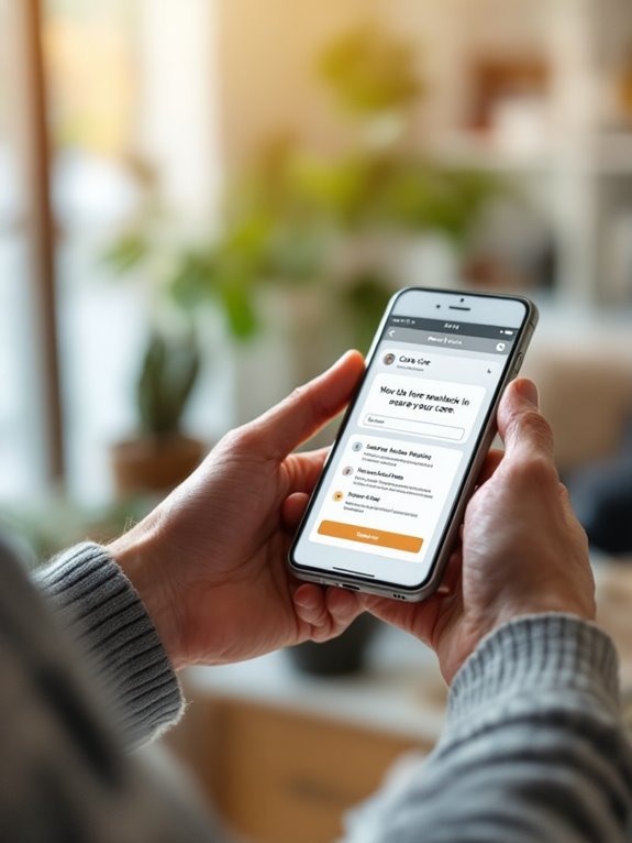
Real-Time Care Updates
Staying Connected with Care Updates
Mobile tech has changed how you keep in touch with family members in care. Our real-time updates improve caregiving through:
- Wearables that track vital signs and notice falls
- Mobile apps for quick chats with carers
- Adjustable notifications for urgent situations
- Private health information sharing among care teams
- Smart home monitors that track daily routines
These tools make care safer while bringing you and your loved ones closer together.
Video Chat Integration
Video chat has transformed how families connect with loved ones in senior care facilities. We've noticed these tools fight isolation and boost emotional health. With 75% of seniors now online, mobile-friendly video platforms are vital.
| Feature | Benefit | Emotional Impact |
|---|---|---|
| Remote Interaction | Reduces isolation | Joy of seeing family |
| Telehealth | Medical access | Peace of mind |
| User-friendly Design | Easier adoption | Confidence |
| Mobile Access | Anytime connection | Comfort |
| Privacy Controls | Safety | Trust |
We find that your loved ones feel more engaged and less alone through regular video calls. Your family members can join important medical consultations remotely, giving you greater involvement in care decisions. Our simple interfaces make technology accessible for all ages, while mobile options let you connect whenever works best for your schedule. We've built strong privacy protections so you can chat with complete peace of mind.
Shared Calendar Coordination
Shared Calendar Coordination
Care schedule coordination becomes simple with shared calendars that link families, seniors and caregivers. These tools cut stress while improving how care teams communicate.
- Google Calendar adds events straight from emails
- Lotsa Helping Hands organises tasks and sends alerts
- CareZone keeps track of medicines and appointments
- CaringBridge offers secure health updates
- Mobile access means everyone stays connected
Building Trust Through Mobile-Optimized Testimonials and Reviews
Questions Often Asked
How Much Does Implementing Mobile-First Design Typically Cost?
Mobile-first design typically costs between $3,000 and $30,000.
Just like growing a real garden, we'll help your idea flourish within this budget range. We focus on creating accessible designs that work for your specific needs, with final pricing varying based on how complex your project is.
Can Seniors With Limited Tech Experience Navigate Mobile-Optimized Websites?
Yes, seniors with limited tech experience can navigate mobile-optimised sites when we design properly for them. You'll see better results with large, easy-to-tap buttons, straightforward menus, and clear step-by-step guidance throughout their visit. We find that keeping things simple and readable helps older users feel more confident using mobile websites, even with minimal technology background.
How Long Does a Mobile-First Site Redesign Take?
How Long Does a Mobile-First Site Redesign Take?
A complete mobile-first redesign typically takes us 14-27 weeks. Your timeline will include 2-4 weeks for planning, 4-8 weeks for design, 6-12 weeks for development, and 2-3 weeks for testing before we launch your site.
Do Mobile-First Websites Require Specialized Maintenance?
Yes, mobile-first websites need specific maintenance. We handle them differently by focusing on testing across various devices, keeping an eye on performance, and fine-tuning touch interfaces. The good news? Your mobile-first site will likely need fewer complex updates than traditional websites because of its streamlined design that prioritises only what's essential. This practical approach makes ongoing maintenance more straightforward for you.
Can We Gradually Transition From Desktop-First to Mobile-First Design?
Yes, gradual mobile-first transition is absolutely possible. We'll help you implement this change in manageable stages:
- Start with your most critical pages first
- Redesign navigation and key directional elements
- Optimise images for faster loading on mobile devices
- Roll out responsive elements across all content areas
This phased approach lets you test performance improvements at each step while maintaining your existing desktop experience. Your users will enjoy a better mobile experience without disruption to your overall site functionality.

